Content

About this webinar
Charts and pivot tables may sound intimidating, but they’re some of the most powerful spreadsheet tools a genealogist can use. In this Webinar Short, you’ll learn the basics of charts and pivot tables in Excel or Google Sheets. You'll also learn the difference between the two. No advanced spreadsheet knowledge is required - just bring your curiosity and genealogical data!
About the speaker

Key points and insights
Managing vast amounts of ancestral data can be a daunting task for genealogists looking to uncover clear historical patterns. In this insightful webinar short, Natalie Webb from Family Tree Technology demonstrates how to transform raw, messy data into visually compelling and organized insights using spreadsheet tools like Microsoft Excel and Google Sheets. By focusing on the powerful functionalities of charts and pivot tables, the session reveals how researchers can easily synthesize family history records, identify research gaps, and track ancestral geographical patterns. Whether managing a small family branch or a massive family tree, utilizing these data management techniques is essential for bringing clarity, structure, and professional analysis to genealogical research.
- The Crucial Role of Data Standardization: Raw genealogical data downloaded from major platforms like MyHeritage often imports with overlapping text, blank columns, and highly specific location details. Standardizing this data—such as simplifying granular birthplaces down to the country level and deleting empty columns before building visuals—is a vital prerequisite to ensure the resulting charts remain concise, readable, and manageable.
- Charts as Missing Research Locators: A standard chart is ideal for summarizing two specific pieces of data, such as counting surnames against a birth country. Beyond providing a clear visual representation of ancestral origins, these charts serve a strategic purpose by highlighting "blanks," allowing genealogists to immediately pinpoint exactly where further historical research is required.
- Pivot Tables for Multi-Dimensional Analysis: For more complex datasets, pivot tables offer a dynamic way to cross-reference multiple variables simultaneously. The webinar demonstrates this by mapping surnames against multiple specific cemeteries, allowing researchers to see a detailed count of which family members are buried where, complete with automatic grand totals to easily manage multi-layered family connections.
To fully grasp these step-by-step digital techniques and see the live spreadsheet demonstrations in action, watching the complete webinar short is highly recommended. Witnessing the transition from raw data downloads to finished visual tools provides invaluable practical context that text alone cannot replicate.
Related webinars
 00:06:12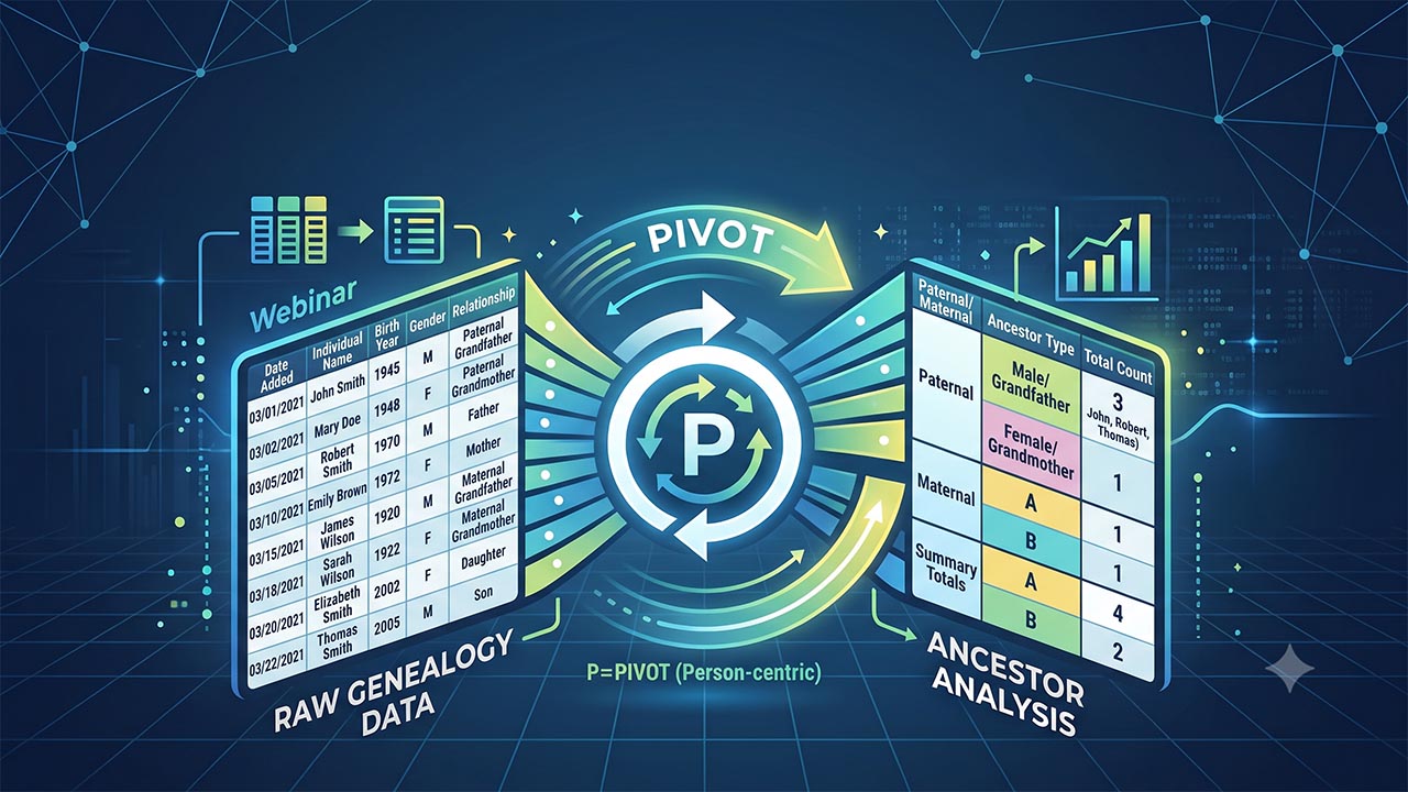
 00:10:24
 00:06:50
 00:05:38
 00:09:35


Comments (2)
Thanks for this. I am lonnnggg retired, rarely use Excel anymore except for simple tables because it doesnt recognize the same language/formats of/for advanced formulas as in my decades of use. Doesnt save them in same excel extension workbooks as it once did. It seems to use mini-apps for advanced baked in formulas and some of the set up or syntac descriptions baffled me! I should of kept up but was into home renovation and restoration thus lost the plot and was too affronted my realized ignorance I just gave up. Heck I didnt even know what a pivot table was until tonight. Never even and bothered to watch a YouTube video to learn how basic they really are! Thank you!
PIvot tables are very powerful. Legacy has a "missing census" search. I do 3 or 4 different census years for a State, and input results into Excel and create a Pivot table. I can then easily just search for the missing documents. Just an example of how to use Legacy and Pivot tables.